testing out the overview
As we have learned, maps are cultural artifacts that we can help us to understand the circumstances of their production and reception. In this assignment, you will choose a historical map and write a short essay analyzing features of the map, relating them to the historical period and drawing attention to the differences (and perhaps continuities!) between “your” map, and modern maps and conceptions. Where appropriate, feel free to include images of map details.
In order to perform this analysis, you will need to learn at least a little bit about the map’s historical period. Our class readings are a good place to start, but depending on your hoice, you may need to learn a bit more. I have published a Zotero bibliography which may be helpful. You can access it online, or download and install Zotero, register as a Zotero user, and then join the group. You will then be able to use the group library directly from Zotero, e.g. for citations in this paper.
While you are welcome to choose your own map, I have gathered a list here which contains maps you are welcome to use. Many of them have appeared in lecture, which may make it somewhat easier to start with them.
Please hand in on Quercus. I have a substantial preference for editable, comment-friendly formats such as .odt and .docx (however, I cannot open Apple Pages documents!!), but will accept .pdf where necessary. Details of layout are not marked in this assignment.
Your paper should be approximately 800 words in length, identifying the map and briefly describing relevant features directly in the service of your argument. Your argument should be clear, compellingly argued, and historically interesting, embedded in an essay with few typographical and grammatical errors.
For short papers, I do not use a formal rubric with point totals for various categories. Instead, I make a holistic assessment, with the strength of the argument having the greatest weight. A B paper is largely successful in meeting most expectations, a C paper has some failings, and D and F have serious deficits. An A paper not only meets all expectations but stands out in some additional respect.
- World Map of Cosmas Inidicopleustes. cf. History of Cartography, v1, ch15
- Babylonian Map of the World. cf. History of Cartography, v1, ch 6, esp. page 113ff.
Our class readings (Edson and Scafi) provide context for all of these maps; you may also be interested in consulting Scaafi’s book, Mapping Paradise
- Psalter map (mappa mundi)
- Hereford map (mappa mundi)
- Matthew Paris’s Itinerary map
- Zonal Map from Macrobius’s /Commentary on the Dream of Scipio/
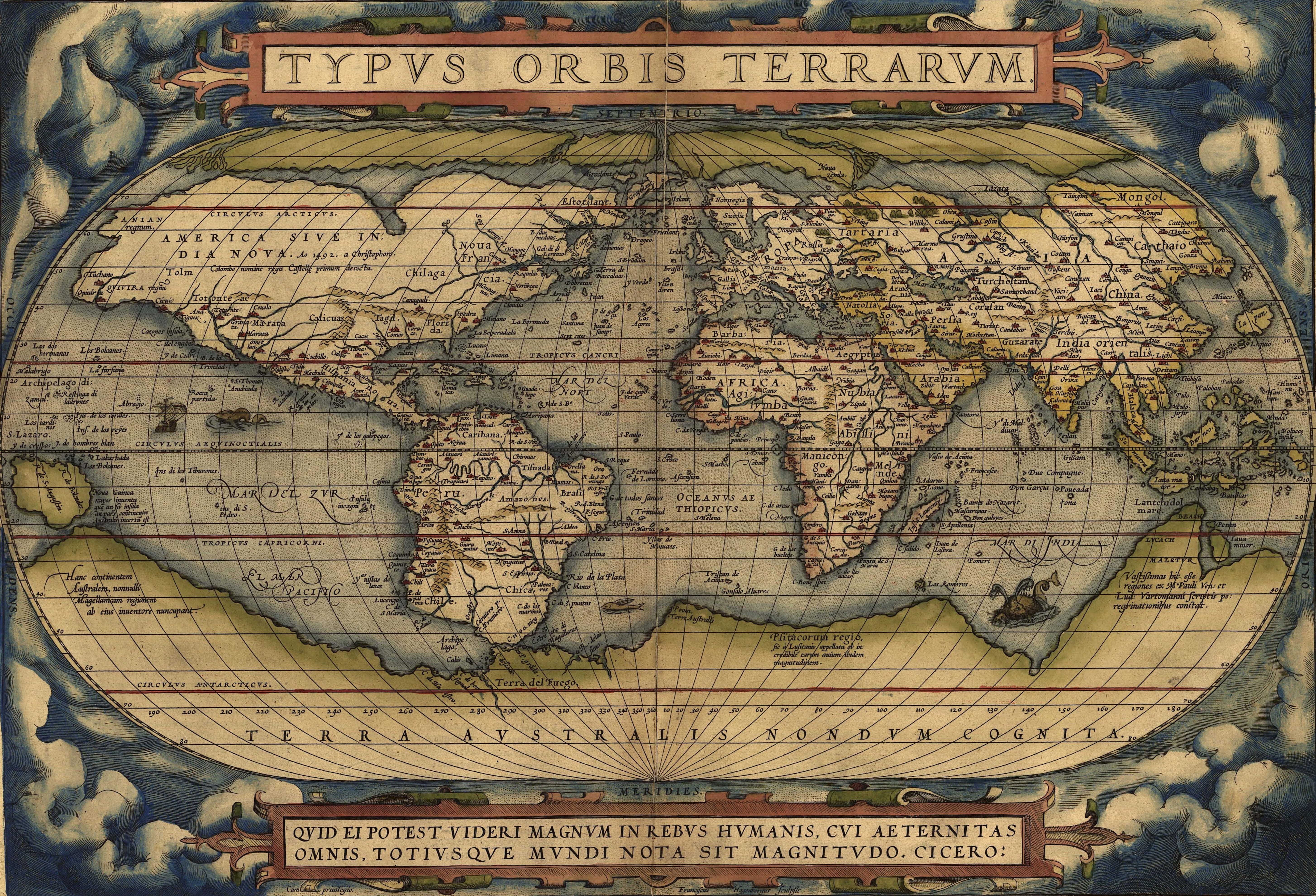
- World Map from Ortelius’s Theatrum Orbis Terrarum (cf. Koch’s Disease Maps, ch.3)
- Arrieta’s Plague Map of the province of Bari in Napoli. cf. Koch, ”Mapping the Miasma”
- John Smith’s Map of “New England”, 1616 or “Virginia”, 1612/1624. cf. MacMillan, Ken. “Sovereignty ‘More Plainly Described’: Early English Maps of North America, 1580–1625.” Journal of British Studies 42, no. 4 (2003): 413–47.
This assignment straddles the previous essay and the next set of assignments. Once again, you are asked to “read” a map as an artifact. In addition, though, you’re asked to re-imagine the map, repurposing it to fit your own purposes. So, you should expect to take issue with some aspect of the map, and then, perhaps playfully, attempt to correct the map’s deficits in a revised version.
Your paper should be approximately 800 words in length, identifying the map and briefly describing relevant features directly in the service of your argument. Your argument should be clear, compellingly argued, and historically interesting, embedded in an essay with few typographical and grammatical errors. The argument should identify deficits of the original map, and the (perhaps only preliminary) improvements you have attempted.
You should link to the original map, and also hand in a version with your edits. If you prefer to make your edits by hand, take a cell phone picture of your finished product and include it in your paper.
Please hand in on Quercus. I have a substantial preference for editable, comment-friendly formats such as .odt and .docx (however, I cannot open Apple Pages documents!!), but will accept .pdf where necessary. Details of layout are not marked in this assignment.
For short papers, I do not use a formal rubric with point totals for various categories. Instead, I make a holistic assessment, with the strength of the argument having the greatest weight. A B paper is largely successful in meeting most expectations, a C paper has some failings, and D and F have serious deficits. An A paper not only meets all expectations but stands out in some additional respect.
In this brief assignment, now due March 09, you will “georeference” a map such that it can be displayed on a geographical information system. Using the online Georeferencer tool, choose one of the maps presented to you by the tool, or upload your own map to the collection. Align at least 8 points on the two maps, until it appears to match extremely well to the underlying base map. When you’re ready, save your changes. Navigate to your profile page on georeferencer.com, and make sure the link to your map is visible there from a private tab (if not, there may be a permissions problem I don’t understand – email me so I can figure out how to help you fix it).
Please hand in a short text document including a link to your georefencer profile page, a full reference for the map (you’ll need to go to the map’s page for this information), and a very short paragraph giving minimal context for the map (learn what you can about the entity that produced the map, and a few words about the map’s purpose).
Georefencer.com provides a relatively simple, web-based interface for referencing map images. As in other, more complex programs, you will align points on the map image to a base map. As you add more points, the map will stretch and distort according to an internal algorithm (you can sort-of control this later!). The more points you add, the more closely your map will align with the base map. When you’re finished, the maps should line up quite well, though there may be some remaining distortion or imperfection.
There are several tools available in the tool; here is a brief introduction to several of them.
First, choose a map from the front page of https://davidrumsey.georeferencer.com :
THIS WILL DUMP YOU INTO A SIDE-BY-SIDE VIEW OF A A RANDOM MAP. IF YOU DON’T LIKE THE ONE YOU GOT, FIND THE “NEXT” BUTTON IN THE LOWER RIGHT HAND CORNER AND CLICK TO GET A DIFFERENT MAP.
TO BEGIN, YOU WILL NEED TO ALIGN AT LEAST 2 OR 3 POINTS SO THAT THE GEOREFENCER KNOWS THE APPROXIMATE LOCATION AND SCALE OF THE MAP.
- ADJUST THE SCALE OF BOTH MAPS USING THE
+AND-BUTTONS ON THE LEFT AND RIGHT EDGES OF YOUR SCREEN. YOU WILL ALSO NEED TO PAN THE LEFT-HAND WORLD MAP TILL YOU GET TO THE APPROXIMATE LOCATION OF MAP THAT YOU’RE REFERENCING. - ONCE YOU’VE IDENTIFIED TWO SPOTS THAT SHOULD BE ALIGNED, CLICK ON ONE MAP – USUALLY THE HISTORICAL MAP – IN THAT SPOT. AN ORANGE “MAGNIFYING GLASS” WILL POP UP ON THAT MAP. FIND THE CORRESPONDING SPOT IN THE OTHER MAP AND CLICK; A SECOND MAGNIFYING LENS WILL POP UP THERE. YOU CAN NOW ADJUST THE TWO LOCATIONS WITH A CLICK-AND-HOLD ACTION ON THE RIGHT-HAND TAB OF THE MAGNIFYING LENS. ONCE YOU’RE HAPPY WITH THE CORRESPONDENCE, RELEASE THE MOUSE. TO SAVE THE POINTS, YOU CAN EITHER CLICK INSIDE THE LENS, OR CLICK DIRECTLY ON THE RIGHT-HAND TAB. TO ABANDON THE POINT, CLICK THE “X” AT THE BOTTOM OF THE LENS.
- THE ABOVE INSTRUCTIONS MAY SOUND COMPLICATED BUT IT’S A LOT EASIER TO UNDERSTAND THROUGH PRACTICE THAN THROUGH WRITTEN INSTRUCTIONS!
AS SCANNED, THESE OLD MAPS HAVE EXTENSIVE BORDERS THAT INCLUDE LEGENDS AND OTHER AUXILIARY INFORMATION. THIS INFORMATION IS IMPORTANT, BUT CAN BE ALSO BE DISTRACTING AND CONFUSING ONCE THE MAP IS OVERLAID. YOU SHOULD USE THE :SCISSORS: CLIP TOOL TO OUTLINE THE PART OF THE MAP THAT CONTAINS THE ACTUAL GEOGRAPHICAL AREA ON THE MAP IMAGE.
- CLICK THE SCISSORS ICON ON THE RIGHT SIDE OF THE TOOLBAR NEAR THE TOP CENTER OF THE MAIN PANE
- ZOOM OUT FAR ENOUGH THAT YOU CAN SEE THE BLUE RECTANGLE AT THE EDGE OF THE MAP
- DRAG ONE OF THE PALE CIRCLES CLOSE TO AN APPROPRIATE MAP POINT
- ADD POINTS TO THE OUTLINE AS NECESSARY BY CLICKING ANYWHERE ON THE BLUE LINE AND DRAGGING TO A GOOD PLACE ON THE MAP
- CONTINUE UNTIL YOU’RE HAPPY WITH THE FINAL PRODUCT. YOU MAY NEED QUITE A FEW POINTS FOR A COMPLEX SHAPE
ONCE YOU HAVE THE MAP APPROXIMATELY ALIGNED, YOU CAN FINE-TUNE THE ALIGNMENT BY ADDING FURTHER POINTS IN OVERLAY MODE. THIS MODE MAKES DIVERGENCE OF THE TWO MAPS SOMEWHAT CLEARER.
- CLICK THE “OVERLAY” BUTTON IN THE CENTRAL TOOLBAR
- GEOREFERENCING IS STILL A 2-STEP PROCESS BUT MAY FEEL A BIT CONFUSING.
- YOUR FIRST CLICK WILL SELECT A POINT IN THE HISTORICAL MAP
- THE NEXT CLICK WILL SELECT THE CORRESPONDING POINT IN THE MODERN MAP
- I FOUND IT PRETTY EASY TO MAKE MISTAKES HERE, SO REMEMBER THAT YOU CAN ALWAYS DELETE THE POINTS BY CLICKING ON THEM TO BRING UP A MAGNIFYING LENS, AND THEN CLICKING THE “X”
- YOU MAY FIND IT USEFUL TO USE THE OVERLAY TRANSPARENCY SLIDER IN THE TOP RIGHT CORNER OF THIS VIEW
- YOU CAN ALSO SHOW/HIDE THE MAP BORDER, AND, FOR FUN, CHANGE THE ALGORITHM USED TO DISPLAY THE OVERLAY, BY CLICKING ON THE :GEAR: ICON ON THAT TOP RIGHT BOX
You can check out this view, which provides a little bit of insight into how the georeferencer actually stores your data. I don’t recommend changing the default transformation, as doing so will actually change the saved data, and the round-trip conversion will be imperfect even if you then revert to the original transform.
When you feel done, press “save” and then “overlay and compare” to get a sense of other ways of interacting with the finished map (e.g., try “swipe” mode).
In your last two assignments, you have taken small steps towards becoming mapmakers (“cartographers” might be a little exaggerated). In the final project you will move further in this direction by building a map-centred narrative – something of a “deep map”, perhaps – using the ArcGIS Storymap Platform. (Note! Please don’t create an account on the default start page! Instead follow the instructions on the MDL website to use the UofT institutional account.)Your project should tell a place-centric story and make use of both maps and images to craft a compelling narrative of approximately 1500 words plus visual aids. You will have powerful tools at your disposal, though barely enough time to learn to use them ( :-/ ). The goal of this exercise is to explore the use of maps as an aid and vehicle for historical narrative. As before, the area and topic of your work should be determined by your pre-existing interests. The topic areas on which we have focused – empire, race, nation-building – are central to the way maps have worked, but they should not be construed as a limitation on the topics you can explore cartographically.
StoryMap was designed for a wide range of uses, many of which lie in the domain of long-form “immersive” journalism. Its default layouts are fullscreen images and embedded web applications, accompanied by intervening textual passages.
This form allows you to construct a more-or-less standard essay form (with introduction, conclusion, and intervening argument) in combination with digital maps which can be arbitrarily data-rich. The maps can be quickly constructed, using the “Express Map” function, or deliberately constructed with the full power of ArcGISOnline. It’s also possible to use non-map media, usually images, in visually impressive ways; but our emphasis here is on the maps.
What you do with this tool depends on your story. Maybe you want simple maps with markers and historical information. Maybe you want dynamic maps that change scale, zooming and panning as you move through the story. And maybe you want to add quantitative data that your research has turned up. All of these things are possible, but you will need to decide what matters most to your project.
The presentation was initially intended as an in-class opportunity to get feedback from your classmates (and me too) about your project and how it might be improved. I had intended it as a short (~10 minute) presentation of your main topic, the pans for your argument, and a rough sketch of the layout.
However: it seems increasingly likely that we will not be in class for the last two weeks of the semester! I think it should be possible to do this over zoom, so that is my intention for now.
I don’t have a formal rubric, but will be assigning grades based on the following criteria:
- topic: is this a significant topic, appropriate to a history class, and dealing with matters of space and place in some way?
- argument: am I convinced by your argument, and is it also interesting and substantive?
- writing: do your write with a minimum of grammatical and stylistic errors, in a way that enhances rather than detracts from your argument?
- use of maps (and other visual aids): are the maps of genuine significance to your argument, or are they mere appendages?
- beauty: You can make really impressive projects with StoryMap. If you’re able to take advantage of its aesthetic qualities, that adds a powerful finishing touch to your project
Storymaps is pretty much point-and-click by default, but also lets you access more advanced features from the ArcGIS Online suite of products. Their online documentation is pretty good, and I recommend these resources:
weekly responses. in-class participation and attendance. Online presence.You have all done a great job. Thank you!
great job everyone
New format for the presentation post-CoViD:- presentations will be replaced by a peer help exchange requirement. We will continue to hold work sessions from 3-6 on Thursdays. The new requirement is: You must hold a brief conversation with someone from the class about your project, and offer some kind of feedback on that person’s project. You can do that via virtual conferencing or using the forums on Quercus, or even via email (in which case you should CC me so I know it’s been done. Everyone who meets the minimum requirements gets an A.