| title | date | published | description | categories | cover_image | |
|---|---|---|---|---|---|---|
How to make a Navbar with react-scroll |
2021-07-30 |
true |
How to build a fluid navbar component in react with built-in scroll to behavior using react JS and react-scroll |
|
Having solid navigation built into your webpage is one of the first steps in building it. So it goes without saying that having a navbar is a crucial part. For my portfolio page, I decided to build a navbar, scouring the web I came across react-scroll.
React-scroll is a library that streamlines the process of creating scroll interactions on the page. This is perfect to make a navbar with fluid scroll-to built-in.
- Sticky navbar
- Nav section inside of the navbar with links
- Links when clicked, scroll to the respective section
First, let's build out the header containing the navbar.
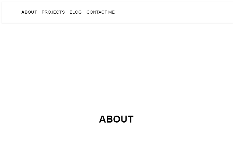
<header>
	<nav>
		<ul>
			<li>ABOUT</li>
			<li>PROJECTS</li>
			<li>BLOG</li>
			<li>CONTACT ME</li>
		</ul>
	</nav>
</header>
Simple enough We have our header with a few sections that we should link to. Next, let’s have a look at what react-scroll has to offer us.
According to the docs they have a Link component. This link component comes with 3 props that interest us: activeClass , spy and to.
- activeClass will change the style of the list element in the navbar when the scroll is over the component
- spy is how to tell react-scroll what element it should watch to apply the activeClass
- to is what element it should scroll to, matched by ID
Taking that into consideration let's add all the props.
       <li>
              <Link activeClass="active" smooth spy to="about">
                ABOUT
              </Link>
            </li>
            <li>
              <Link activeClass="active" smooth spy to="projects">
                PROJECTS
              </Link>
            </li>
            <li>
              <Link activeClass="active" smooth spy to="blog">
                BLOG
              </Link>
            </li>
            <li>
              <Link activeClass="active" smooth spy to="contact">
                CONTACT ME
              </Link>
            </li>
Great! Now let's create the sections, they should link to parts that are right below our header.
<section id="about">ABOUT</section>
<section id="projects">PROJECTS</section>
<section id="blog">BLOG</section>
<section id="contact">CONTACT ME</section>
If you went noticed the smooth prop was also added to links. This is to add smooth-scroll behavior.
And with that, we’re done! All that's left is to add some styles so the sections have an adequate amount of space. Also, let's apply some styling to the navbar itself so it has that sticky property specified in the requirements:
section {
	display: grid;
	place-items: center;
	height: 100vh;
	font-size: 32px;
	font-weight: bold;
}

.nav {
	display: flex;
	align-items: center;
	position: -webkit-sticky;
	position: sticky;
	top: -5px;
	z-index: 2;
	height: 70px;
	min-height: 70px;
	width: calc(100% - 1.5rem);
	background-color: #fff;
	padding: 0 1rem;
	box-shadow: 0 0.125rem 0.25rem 0 rgb(0 0 0 / 11%);
}
Check out the full working example and the rest of the styles applied:
https://codesandbox.io/embed/react-navbar-gzext?fontsize=14&hidenavigation=1&theme=dark