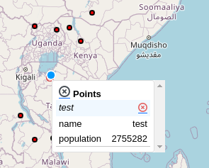
Popup component
A tooltip like panel can be added when hovering over or clicking a feature to display its attributes.
import {HsConfig} from 'hslayers-ng';
@Component({
  selector: 'your-app-component',
  templateUrl: 'your-app-component.html',
})
export class YourAppComponent {
  constructor(hsConfig: HsConfig) {
    this.HsConfig.update({
      popUpDisplay: 'hover' // 'click', 'none'
    });
  }
}
Add HsQueryModule import:
import {HsQueryModule} from 'hslayers-ng';
@NgModule({
  imports: [HsQueryModule],
})
export class YourAppModule {}
Add HsQueryFeaturePopupComponent component:
import {HsLayoutService, HsQueryFeaturePopupComponent} from 'hslayers-ng';
@Component({
  selector: 'your-app-component',
  templateUrl: 'your-app-component.html',
})
export class YourAppComponent {
  constructor(hsLayoutService: HsLayoutService) {
    hsLayoutService.createOverlay(HsQueryFeaturePopupComponent, {});
  }
}