forked from sacooper74/Garmin
-
Notifications
You must be signed in to change notification settings - Fork 0
/
Copy pathexplore.Rmd
363 lines (266 loc) · 17.5 KB
/
explore.Rmd
1
2
3
4
5
6
7
8
9
10
11
12
13
14
15
16
17
18
19
20
21
22
23
24
25
26
27
28
29
30
31
32
33
34
35
36
37
38
39
40
41
42
43
44
45
46
47
48
49
50
51
52
53
54
55
56
57
58
59
60
61
62
63
64
65
66
67
68
69
70
71
72
73
74
75
76
77
78
79
80
81
82
83
84
85
86
87
88
89
90
91
92
93
94
95
96
97
98
99
100
101
102
103
104
105
106
107
108
109
110
111
112
113
114
115
116
117
118
119
120
121
122
123
124
125
126
127
128
129
130
131
132
133
134
135
136
137
138
139
140
141
142
143
144
145
146
147
148
149
150
151
152
153
154
155
156
157
158
159
160
161
162
163
164
165
166
167
168
169
170
171
172
173
174
175
176
177
178
179
180
181
182
183
184
185
186
187
188
189
190
191
192
193
194
195
196
197
198
199
200
201
202
203
204
205
206
207
208
209
210
211
212
213
214
215
216
217
218
219
220
221
222
223
224
225
226
227
228
229
230
231
232
233
234
235
236
237
238
239
240
241
242
243
244
245
246
247
248
249
250
251
252
253
254
255
256
257
258
259
260
261
262
263
264
265
266
267
268
269
270
271
272
273
274
275
276
277
278
279
280
281
282
283
284
285
286
287
288
289
290
291
292
293
294
295
296
297
298
299
300
301
302
303
304
305
306
307
308
309
310
311
312
313
314
315
316
317
318
319
320
321
322
323
324
325
326
327
328
329
330
331
332
333
334
335
336
337
338
339
340
341
342
343
344
345
346
347
348
349
350
351
352
353
354
355
356
357
358
359
360
361
362
363
---
title: "The R in Running"
subtitle: "Exploratory Data Analysis in R of Garmin Running Log"
author: "Steve Cooper"
date: "26 February 2018"
output: html_document
---
# The R in Running
In celebration of having recently completed the excellent [Coursera Data Science Specialization](https://www.coursera.org/specializations/jhu-data-science), I'm going to take a few blogs to apply some of my learnings on a hobby dataset. The specialization teaches the basics of getting and cleaning data, exploratory data analysis, reproducibility, statistical inference, regression models, practical machine learning and developing data products. In this blog series I'll use a similar breakdown, starting here with getting and cleaning data, exploratory data analysis and reproducibility. I'll cheat on the reproducibility by saying that this entire blog was written in [R Markdown](https://rmarkdown.rstudio.com/) (this code should run for anyone with a Garmin exercise log saved within a local R Studio project folder) and available in Git.
## The Dataset
The dataset that I'll be using is from my [Garmin Forerunner 620](https://www.dcrainmaker.com/2013/11/garmin-forerunner-review.html). This is a great gadget, providing key [running metrics](https://www.youtube.com/watch?v=kNCnKpLUoAw) on date, distance, calories, time, heart rate, cadence, pace, elevation, stride, vertical oscillation and ground contact time. With [Garmin Connect](https://connect.garmin.com/modern/) runners are able to sync their watch with their online profile, share with e.g. strava. The Garmin Connect interface, however, has a number of shortcomings in terms of exploring your data and developing insights. A perfect use-case for R and bit of data science magic!
The specific questions that I want to address are:
- What influences my overall fitness? Using [VO2 Max](https://www.youtube.com/watch?v=eAN2JKpDL60) as a gauge of fitness.
- How does my running form influence my training effectiveness? Leveraging [running dynamics](https://www.youtube.com/watch?v=kNCnKpLUoAw) to indicate running form.
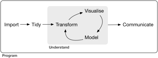
For the purposes of this EDA, we'll be using Hadley Wickham's tidyverse packages and overarching model of "import - tidy - understand - communicate":
<center>
</center>
```{r setup, include=FALSE}
# load libraries and prerequisites
library(tidyverse)
library(ggcorrplot)
```
# Import the Data
We'll leverage the tidyverse readr package for the import. `read_csv()` is great for comma delimited files. It returns a useful report on the import and performs some basic assistance, for example, deduplicating duplicate column names. In addition, it provides additional parsing assistance, using a simple [heuristic](http://r4ds.had.co.nz/data-import.html#parsing-a-file) to try and figure out the column type based on the first 1000 rows. In most cases, it correctly interprets characters, numeric, integer and time formats. The field types can be reviewed with the `spec()` function. It is good practice to review `problems()` in order to ensure that all columns have been correctly parsed. For example, we can see that the time, date fields have had problems, these were solved by setting column specifications during import.
There is a more detailed write-up of the package in Hadley Wickham's book ["R for Data Science"](http://r4ds.had.co.nz/data-import.html).
```{r import}
# import the file, overriding "TIme" upon import, otherwise it will be set to col_type Time and values lost
activities_raw <- read_csv("Activities_Master.csv",
col_types = cols(
Date = col_datetime(format = "%d/%m/%Y %H:%M"),
Time = col_character(),
`Avg Pace` = col_time(format = "%M:%S")
),
na = "--")
# some useful readr functions:
# spec(activities_raw) # review parsed column formats
# problems(activities_raw) # review problems during parsing
# activities_raw # review the final "tibble"
# remove spaces from field names
names(activities_raw) <- make.names(names(activities_raw))
```
## Review the Data
Once imported, we are at a point to perform some basic exploration of the dataset reviewing the dimensions, [five number summary](https://en.wikipedia.org/wiki/Five-number_summary), mean etc. We see that the columns after "Average Ground Contact Time" are largely blank, we can therefore remove them from future analysis.
```{r}
# some basic information (rows and columns)
dim(activities_raw)
```
```{r}
# five number summary of columns 5:10
summary(activities_raw[,5:10])
```
```{r}
# remove blank columns
activities_raw <- select(activities_raw, 1:20)
```
```{r}
# review the structure
str(activities_raw[1:5,])
```
```{r}
# let's have a look at the first 5 rows of data
head(activities_raw)
# similarly, the last 5 rows of data
tail(activities_raw)
```
```{r}
# counts - table with means?
table(activities_raw$Activity.Type) # I guess i'm not a cyclist
```
# Transform the Data
Now that we've imported our data, we will perform some basic transformation.
One of the biggest problems with the Garmin data extract is that the `Time` field is in the format of "00:00:00", but not consistently applied as e.g. mm:ss:cc. A run of 50 minutes, is stored as 50:00:00, whereas a run of 65 minutes is stored as 01:05:00. For this reason, we need to store as character type, seperate and perform some `ifelse()` logic.
We perform some other, simple, transformations, including the creation of categorical variables for elevation gain and [binning](https://www.r-bloggers.com/plot-weekly-or-monthly-totals-in-r/) the `Date` into weeks and months.
Of perhaps more interest is fairly crude calculation of [VO2 Max](https://www.fetcheveryone.com/forum__58727__how_does_garmin_connect_calculate_vo2_max). VO2 max is a measure of fitness potential. The VO2 max is the maximum volume of oxegyn that can be consumed per minute, per kilogram of body weight, at your maximum performance. For my age group, the typical ranges [percentiles](https://www8.garmin.com/manuals/webhelp/forerunner620/EN-US/GUID-1FBCCD9E-19E1-4E4C-BD60-1793B5B97EB3.html) are 52.5+ as 95 percentile, 46.4+ as 80 percentile etc.
```{r transform, warning=FALSE}
# Separate "Time" into component parts - converting to integers
activities_tidy <- separate(activities_raw, Time, into = (c("minute", "second", "centisecond")), convert = TRUE)
# Calculate total minutes, if first character is less than 5, treat as an hour unit, else, assume it's in minutes
activities_tidy$tot_mins <- ifelse((activities_tidy$minute < 5),
activities_tidy$minute * 60 + activities_tidy$second,
activities_tidy$minute)
# group elevation gain into categorical variables "high" and "low"
activities_tidy$gain <- ifelse(activities_tidy$Elev.Gain > 250, "high", "low")
# Bin the time series values to weeks and months: https://www.r-bloggers.com/plot-weekly-or-monthly-totals-in-r/
activities_tidy$week <- as.Date(cut(activities_tidy$Date, breaks = "week"))
activities_tidy$month <- as.Date(cut(activities_tidy$Date, breaks = "month"))
# Gauge
#activities_tidy$cadence_gauge <- activities_tidy %>%
# if (`Avg Cadence` > 183) {return("purple")}
# Calculate VO2 Max per https://www.fetcheveryone.com/forum__58727__how_does_garmin_connect_calculate_vo2_max
# calculate meters per minute
activities_tidy$mpm <- (activities_tidy$Distance*1000)/activities_tidy$tot_mins
# calculate VO2
activities_tidy$vo2 <- -4.6+0.182*activities_tidy$mpm+0.000104*activities_tidy$mpm^2
# calculate % VO2 Max
activities_tidy$percentVO2 <- (activities_tidy$Avg.HR/activities_tidy$Max.HR -0.37)/0.64
# calculate VO2 Max in ml/min/kg
activities_tidy$vo2max <- activities_tidy$vo2/activities_tidy$percentVO2
```
## Missing Data
Of the `r dim(activities_tidy)[1] * dim(activities_tidy)[2]` values in the raw table, we can see that `r round(mean(is.na(activities_tidy)),2)`% are blank (NA). Missing data is therefore not prevalent in the dataset, however, it is not random, we will see later that the pattern is significant.
```{r}
# check for blanks and n/a
# x0 <- activities_raw$Avg.Cadence
# class(x0)
# str(x0)
# summary(x0) # we can see we have some NA's
# mean(is.na(x0)) # is that missing data a problem?
# mean(is.na(activities_raw))
filter(activities_tidy, is.na(activities_tidy$Avg.Cadence_1))
```
## Outliers
Normalize and review outliers via SD.
```{r}
# outliers
# normalize VO2 Max
# standard deviation ranges
# sd(activities_tidy$vo2max)
```
# Exploratory Data Analysis
Now the fun starts! We can start testing some of our hypotheses of the data.
At this point we can start to explore the dataset, missing data, outliers and categorical variables. This exercise is best performed with the data dictionary to hand. Here we use [Garmin's Forerunner manual](https://www8.garmin.com/manuals/webhelp/forerunner620/EN-US/GUID-3F11326C-3DE8-4AF2-BC8F-8EA427E9F189.html).
## Univariate Analysis
We'll just look at single dependent variables and understand more about them. As mentioned, we will take VO2 max as the best indicator of fitness.
```{r univariate, message=FALSE}
summary(activities_tidy$vo2max)
# frequency distribution
activities_tidy %>%
ggplot(aes(vo2max, color = Activity.Type)) +
geom_freqpoly()
```
We can see that we have different activity types and that they have different VO2max. Taking all types into account, we see that the data deviates from the normal distribution, has appreciable positive skewness and shows peakedness. Let's filter cylcing out of our data.
```{r univariate2, message=FALSE}
# frequency distribution
activities_tidy %>%
filter(Activity.Type != "cycling") %>%
ggplot(aes(vo2max, y = ..density.., color = Activity.Type)) + # note: y has been set to density instead of count
geom_freqpoly()
```
Still showing skew and peakedness, but less than previously. Given the relatively sparse dataset (only 112 observations), we can assume much of that peakdeness would disappear with more data points. VO2 Max would approach something similar to a normal distribution.
## Multivariate Analysis
Here we'll try to understand how the dependent and independent variables relate. We will assess both continuous and categorical values.
### Relationship with Numerical Variables
We can see a nice linear relationiship between VO2 Max and Average Pace. I tend to run fastest at a higher VO2 Max. No surprises, however, given that VO2 Max is a function of meters per minute. We're best to ignore that relationship.
```{r}
# Plot: We can see a direct relationship between Vo2Max and Average Pace - via scatterplot
activities_tidy %>%
filter(Activity.Type != "cycling") %>%
ggplot(mapping = aes(Avg.Pace, vo2max)) +
# facet_grid(. ~ `Activity Type`) +
geom_point(mapping = aes(color = gain)) +
geom_smooth(method = "lm", se = F) +
geom_point(size = 7, colour = "black", alpha = 0.4) +
geom_point(size = 5, colour = "red", alpha = 0.4)
# geom_jitter() +
activities_tidy %>%
filter(Activity.Type != "cycling") %>%
ggplot(mapping = aes(Avg.HR, vo2max)) +
geom_point() +
geom_smooth()
# Correlation
cor(activities_tidy$vo2max, activities_tidy$Avg.HR)
activities_tidy %>%
filter(Activity.Type != "cycling") %>%
ggplot(mapping = aes(Avg.Pace, vo2max)) +
geom_point() +
geom_smooth()
```
We can see similar linear relationships in Average Cadence (number of steps per minute). This aligns nicely with running dynamics philosophy that states higher cadence will generally lead to higher run performance.
```{r}
activities_tidy %>%
filter(Activity.Type != "cycling") %>%
ggplot(mapping = aes(Avg.Cadence, vo2max)) +
geom_point() +
geom_smooth()
# correlation
cor(activities_tidy$vo2max, activities_tidy$Avg.Cadence_1, use = "pairwise.complete.obs")
```
Unfortunately, whilst there is a linear relationship between VO2 Max and Date, the relationship is rather flat. This is perhaps explained by the fact that my training goes through cycles of enthusiasum and relative laziness.
```{r multinum, message=FALSE}
# Plot: Cadence over Time
activities_tidy %>%
ggplot(mapping = aes(Date, vo2max)) +
geom_point() +
# legend ** for the colours
geom_smooth()
```
```{r}
# # Plot: Time and Distance
# # ADD: mean
activities_tidy %>%
ggplot(aes(week, tot_mins)) +
geom_bar(color = "black", alpha=.5, size=0, show.legend = NA, stat = ("identity")) +
geom_smooth() +
scale_x_date(date_breaks = "3 month", date_labels = "%b %Y")
```
### Relationship with Categorical Variables
Compared with categorical variables, we can see that my VO2Max is generally higher for my training runs (track and tempo runs) and considerably lower for trail runs. Track runs tend to have a tighter range.
```{r}
# VO2Max and Run Type
activities_tidy %>%
filter(Activity.Type != "cycling") %>%
ggplot(aes(Activity.Type, vo2max)) +
geom_boxplot()
```
In summary, based upon a fairly simple analysis, we can conclude that:
- VO2 Max has a fairly normal distribution.
- It has a positive linear relationship with pace, cadence and heart rate.
- Different activity types have different relationships with VO2 Max.
## And the rest of the dataset
Of the 30 or so variables, we have only analysed a handful. These were based upon following our intuition or hypothesis, albeit based upon fairly sound research. We shall now employ broader methods to objectively complete the feature review and selection.
We can see that the people who built the Forerunner knew what they were doing. The running dynamics features of `Average Cadence`, `Vertical Oscillation` (the degree of bounce in running motion) and `Ground Contact Time` (how much time your foot spends on the ground) all have a tight (0.8) correlation with VO2 Max. The former is positive with the latter two being inverse (as vertical oscillation increases, VO2 Max decreases).
```{r multivariate, message=FALSE, warning=FALSE}
# We can use Correlogram to look at this
nums <- sapply(activities_tidy, is.numeric)
corr <- round(cor(activities_tidy[,nums], use = "pairwise.complete.obs"), 1)
ggcorrplot(corr, lab = T, lab_size = 3, method = "circle", colors = c("tomato2", "white", "springgreen3"))
```
```{r}
# scatter plot for all numeric variables
pairs(activities_tidy[,nums])
```
# Testing our Statistical Inference Assumptions
We now have a pretty good understanding of our dependent and independent variables. Before we start on statistical inference, however, we need to test the underlying assumptions that will allow us apply multivariate techniques:
- Normality - is the data in a normal distribution? This is important for statistical inference techniques that we'll soon use, such as t-tests.
- Homoscesdasticity - the assumptions that the dependent variable exhibits the same level of variance as the independent variables.
- Linearity - already tested for.
We saw above that the VO2 Max exhibits largely normal distribution. We can take this further by performing a simple log transformation on the data:
```{r}
# frequency distribution
activities_tidy %>%
filter(Activity.Type == "running") %>%
ggplot(aes(log(vo2max), y = ..density.., color = Activity.Type)) + # note: y has been set to density instead of count
geom_freqpoly(binwidth = 0.1)
```
# Summary
We've imported and transformed the data. Some fairly simple exploratory data analysis has proven a few key findings:
- VO2 Max is a good measure of fitness, showing a linear relationship with Avg.Pace.
- It has a strong relationship with independent variables of Avg.Cadence, Vertical Oscillation and Average Ground Contact Time. Less so, but still relevant with Average Stride Length.
- It meets the assumptions required to perform statistical inference and to start to make predictions.
## Save RData file
Finally, we'll save our R Data image ready for re-use during our next phase of analysis:
```{r save}
# we can also write to csv
# write_csv(activities_raw, "activities_raw.csv")
# save global environment to RData file
save.image(file = "activities.RData")
```
# Appendix
References:
1. Comprehensive data exploration with python: https://www.kaggle.com/pmarcelino/comprehensive-data-exploration-with-python/
2. R for Data Science: http://r4ds.had.co.nz/
3. R Markdown Cheat Sheet: https://www.rstudio.com/wp-content/uploads/2015/02/rmarkdown-cheatsheet.pdf
4. Exploratory Data Analysis with R: https://bookdown.org/rdpeng/exdata/exploratory-data-analysis-checklist.html
5. Correlogram: http://r-statistics.co/Top50-Ggplot2-Visualizations-MasterList-R-Code.html#Histogram
6. Metrics: https://www.wareable.com/running/your-running-watch-explained-what-does-cadence-vertical-oscillation-and-hr-max-mean
7. Running data: https://www.livescience.com/50706-analyzing-running-data.html
8. Garmin codebook: https://www8.garmin.com/manuals/webhelp/forerunner620/EN-US/GUID-FA8A198E-788C-4E54-83BE-3747FEF7FD2B-homepage.html
9. Histograms and frequency in ggplot: http://ggplot2.tidyverse.org/reference/geom_histogram.html
10. EDA Case Study (Coursera): https://www.youtube.com/watch?v=VE-6bQvyfTQ&list=PLqWwjUXrFNL0I4_tnIbDcVS2V_Z_t5ZLX&t=0s&index=36
11. Scatterplot matrices with ggplot: https://gastonsanchez.wordpress.com/2012/08/27/scatterplot-matrices-with-ggplot/
12. Centering Text in R Markdown: https://stackoverflow.com/questions/24677642/centering-image-and-text-in-r-markdown-for-a-pdf-report
13. Forerunner 620: Running Dynamics with Dr. Jack Daniels: https://www.youtube.com/watch?v=kNCnKpLUoAw
14. Subtitles in R Markdown: https://stackoverflow.com/questions/26043807/multiple-authors-and-subtitles-in-rmarkdown-yaml
15. Forerunner 620: VO2 Max: https://www.youtube.com/watch?v=eAN2JKpDL60