UI Kit v2.3.0
Introducing AMP:zap: and a new way to find Components
This UI Kit release (version 2.3) is a part of Mobify’s November product release plan. It aligns with the Progressive Mobile SDK: version 0.23.0. Download the kit on its own by using the Download link, or download the source files and kit requirements from this repo’s master branch. (Both are available below.)
What’s New?
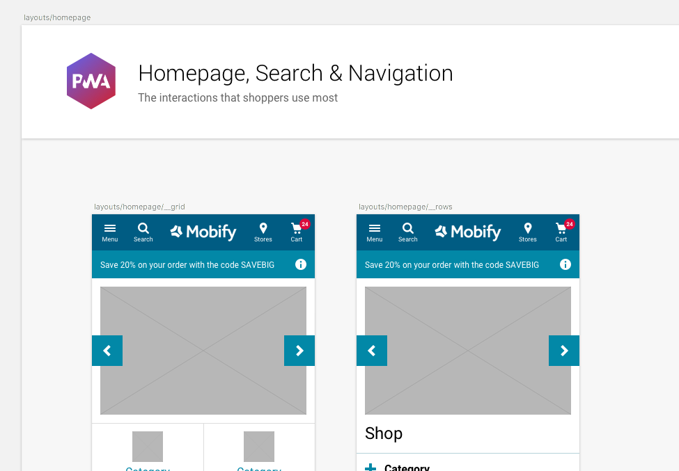
- Component page … We've added a new page, and with it a new way to find the latest SDK components. Instead of using the Symbols page to find and edit components, this page groups all the components together under their respective symbol paths. Use this page to locate a component before copying and pasting into your layout design.

- AMP Components … Mobify's AMP SDK is a collection of components designed to work on Google's Accelerated Mobile Pages. The Components page groups them together so that you know which of the PWA components are AMP-ready. Visually, the AMP and PWA templates should appear the same; therefore, these components are made of the same symbol. Updates to symbols will be applied everywhere.

- Best Practice Layouts … We've cleaned up the pages and grouped every template under one Layouts page. This makes it easier for developers to find the templates they're looking for, including all additional states and modals.
- AMP Layouts … On the UI kit's Best Practice Layouts page we've introduced AMP layouts. These represent Mobify's tried and tested techniques for composing AMP templates using the Mobify AMP SDK suite of components.

- Improved SDK parity … We've worked to reduce any disconnection between the kit and what's in the SDK. This means that any component you choose to include from the Mobify UI kit has a corresponding full tested SDK component (unless indicated on the Components page).
Was New In v2.2.1…
-
Add to Homescreen … a feature of the Android Chrome browser which allows the “installation” of the PWA to a user's homescreen behind an app icon. The user can then launch the site, in the same way they might launch an app, as a focused experience without the browser bar.
-
Share Component … for use anytime the user interaction is to share the URL via email or on social media. The Share function also allows a user to print the page or copy the URL instead of using the browser UI.
-
InlineAsk Component … designed to group together the prompts to sign up to the newsletter and for push notifications. The component can be varied to only show the email option if the device does not support push notifications.
Contribute
Check out the README to see how you can contribute back into the UI Kit.
Need Help?
If you encounter a bug, get stuck on using the kit, or want to see something new added, please open up an issue in the parent GitHub repo, or open up a pull request so that we can have a discussion!
Happy building! ❤️