UI Kit v2.6.0
A new and improved Add to Home Screen + bug fixes 🌴
This UI Kit release (version 2.6.0) is a part of Mobify’s August product release. It aligns with the Progressive Web SDK: version 1.4.0. Download the UI Kit on its own by using the Download link, or download the source files and kit requirements from this repo’s master branch.
What’s New in v2.6.0?
- Add to Home Screen ➡️ Full Screen Mode … We've renamed the Add to Home Screen pattern to Full Screen Mode since the screens show how the user can launch the PWA in the same way they might launch an app, as a focused experience without the browser bar (FullScreenMode).

- Add to Home Screen - a new way to prompt the user … In Chrome 68 and later, we can use a custom prompt to show the official modal for the Add to Home Screen feature. This allows us to prompt the user within the app itself, instead of relying on the browser's built-in prompts.
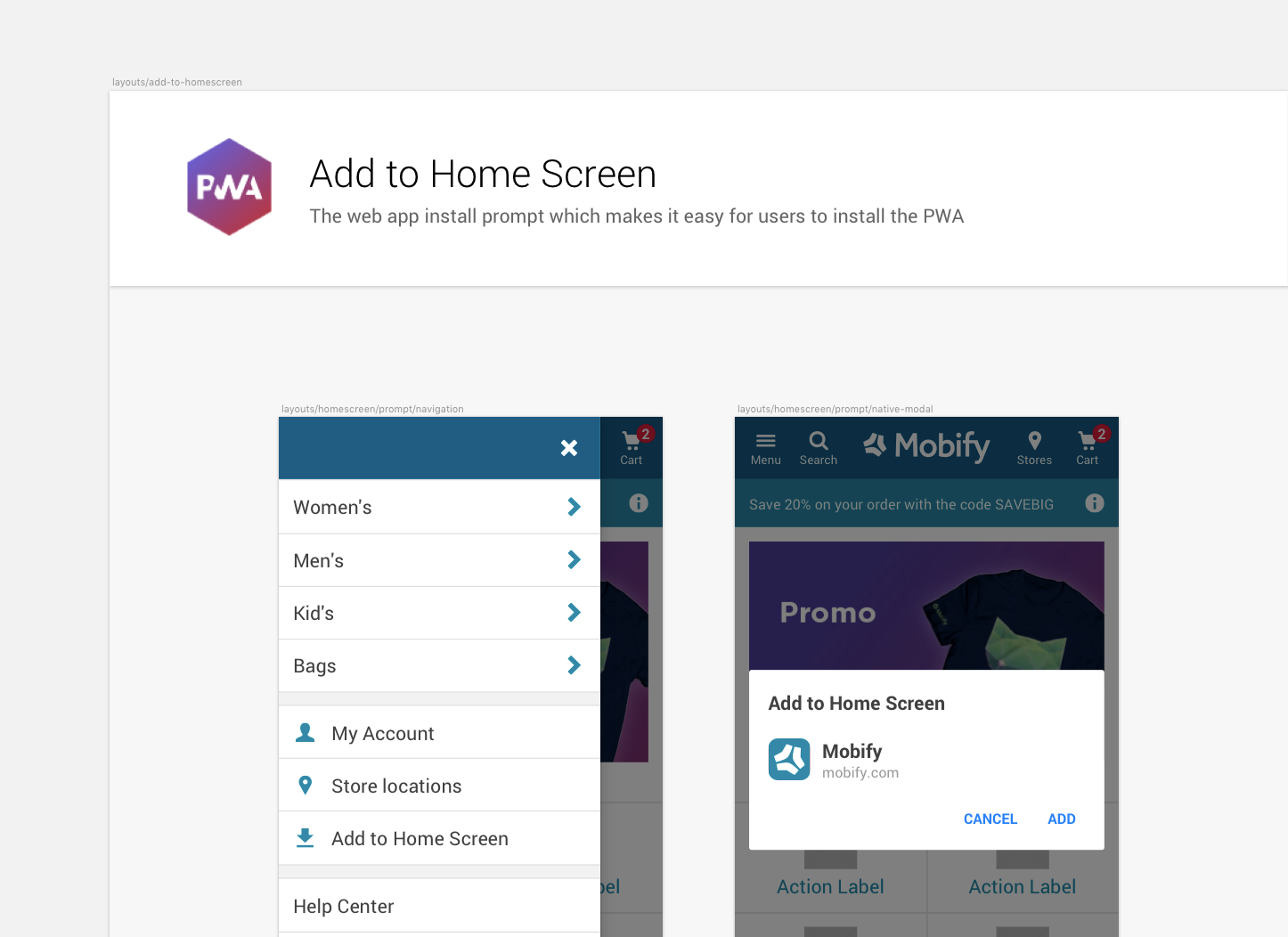
- Accounting for edge cases on Add to Home Screen … The Chrome browser can only display the official modal for Add to Home Screen once per session. If the user clicks Cancel in the official modal, we can replace our custom prompt in the menu drawer with a message that asks the user to refresh the page and try again.

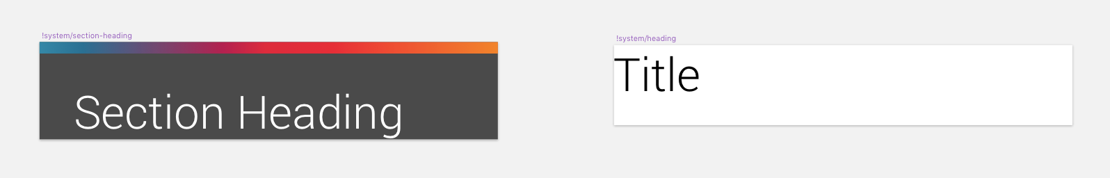
- Updating duplicate symbol headings … There was a small instance where two symbols had the same name. We've renamed one to !system/section-heading and the other to !system/heading
- Relinking HeaderBar symbol to its color palette … Some instances of HeaderBar linked to unused libraries 🤔 We've now cleaned that up so all instances of HeaderBar will update if the background color is changed.

Was New In v2.5.0
-
Updates to existing InlineAsk component … We've updated our best practice subscription flow to be GPR compliant. Ensuring there is space to offer more explanatory text and links to further information.
-
A more effective way for users to opt in … We've added some new patterns to support opt in flows. Instead of using check boxes, use buttons to present the user with a clear choice.
-
Privacy tooltips & new popover component … We've introduced a new component (Popover) to allow for more information to be expanded inside a tooltip. This is present in the checkout to hold more information about security and privacy.
-
My Account mocks … Within the Best Practice Layouts section are a few My Account mocks featuring a GDPR-compliant level of clarity when users are creating an account.
Need Help?
If you encounter a bug, get stuck on using the kit, or want to see something new added, please open up an issue in the parent GitHub repo, or open up a pull request so that we can have a discussion!
Happy building! ❤️