Add bracketleft/bracketright wider glyphs #36
Conversation
|
Thanks for this PR! The screenshots were generated with Preview on OS X. I can space bar on the *.glif file for Preview to show an image of the shape. Any approach to a black on white display is fine. We have been creating new issue reports and uploading the images there, then using the imported URL strings for the README in the glyph directory. Check out the raw Markdown in the other README.md files for the formatting. They are set at height="60". Let me know if you have trouble coming up with something that works and I would be happy to take care of the images. |
|
For my knowledge, does wider indicate that there is more whitespace between the glyph and the adjacent glyph or that the weight of the glyphs is increased? |
|
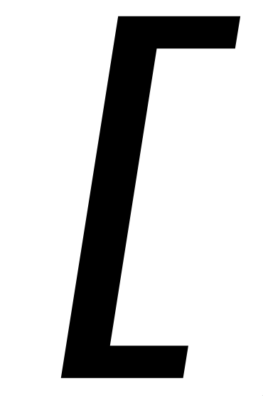
@chrissimpkins Sorry, I wasn't very clear with that "wider" nomenclature. What I meant is that the character itself is left at the same width (being a monospaced typeface of course), but I've moved the glyph's control points around so that the brackets themselves are wider horizontally, while remaining centered horizontally. The screenshots are below, I'll attach them to the README. (There's also a specimen screenshot in my repo.) Left bracket: Right bracket: |


|
Great thanks for the explanation. Out of interest, did you re-center the glyphs (i.e. move right bracket to the left and left bracket to the right)? I added additional whitespace on the adjacent glyph side intentionally and am interested in whether this was a part of the design that you modified for future reference. |
|
GTG! Merging |
|
@chrissimpkins So what I did was: I selected these four (yellow) control points, moved them -100 horizontally, then selected the other four (red) and moved them +100 horizontally. I did this "-100, +100" offset thing for all glyphs. |

|
@vl4dimir Ah, got it now. Thank you! |
|
@vl4dimir I am going to take a look at these changes in some of our source specimens. This may be a change that should be the default in the upstream. Will need a detailed review in different bodies of source. Interested in pitching in on this work? |
|
@chrissimpkins Of course! Let me know how I can help. BTW which application are you using for designing Hack? I used FontForge but was thinking about purchasing a Glyphs license. |
Want to join me over in this thread source-foundry/Hack#363 and we will discuss it? We have a source code corpora that contains > 1M tokens of source per programming language across the most commonly used programming languages and we can create some specimen sheets to review how the brackets are used, what they appear next to, and how your changes (and potentially other necessary changes) improve upon the design. I tagged this for v3.002 work. We are about to push v3.001
The goal is to support any font editor that works on UFO source. Most of us who have contributed recent design changes have used Glyphs following the transition to UFO source files (I previously did the work on v2.x releases in FontLab Studio V), though there have been some significant changes that came through FontForge. If you'd like to stick with an open source editor, Trufont is another one that you can check out (available here on Github by Adrien Tetar and crew). I just purchased an upgrade license for FontLab VI which is a fantastic upgrade and am going to be working on improvements in the ASCII sets in that over the next few releases. You are beginning to answer the question of how deep the rabbit hole goes :) |
@chrissimpkins Guess so! 🤣 Thanks, I'll give TruFont a try, I somehow managed to miss it completely. I'll join you on that other thread. |
|
@vl4dimir removed your alternates here. They are now defaults ;) 👏 |
Adding wider versions of
bracketleftandbracketright. Try before you buy: https://github.com/BRUTALISM/Hack 😉@chrissimpkins Can you tell me how you made those screenshots in each glyph's README, so I can update the PR to match? I see they're not hosted inside the repo, did you use GitHub's new file dialog to add the README and magically upload the images to githubusercontent?