First templates
Before reading this you should read the docs about [building grids](Building grids), and you should know what blocks and figures are.
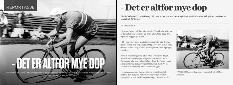
Note that a template does not have to be a grid. E.g. a template with a large background image and an absolute positioned title above it, is not a grid. The example below illustrates this. The template on the left is not a grid, while the one on the right is.
The [article comes preformatted and structured](Article import format) in blocks and figures.
When building a template you create:
- Containers to target the figures
- Regions to target the blocks
ALF will detect what template that matches best for each page, based on the content of the article.
<div data-map="article" class="alf-template alf-grid alf-cols-2">
    <div class="alf-col-1 alf-colspan-2 alf-container" data-map="title"></div>
    <div class="alf-col-1 alf-flex alf-region"></div>
    <div class="alf-col-2 alf-flex alf-region"></div>
</div>
Say we're applying the above template to an article with this content:
<article>
    <figure>
        <h1 data-map="title">Title of the article</h1>
    </figure>
    <p>A paragraph with lots of text</p>
    <p>A paragraph with lots of text</p>
    <p>A paragraph with lots of text</p>
    <p>A paragraph with lots of text</p>
    <p>A paragraph with lots of text</p>
    <p>A paragraph with lots of text</p>
    <p>A paragraph with lots of text</p>
    <p>A paragraph with lots of text</p>
</article>
ALF will find the matching containers and figures first, then it'll flow the blocks through the regions untill they're all filled, or we run out of content.
The result will look something like this:
<div data-map="article" class="alf-template alf-grid alf-cols-2">
    <div class="alf-col-1 alf-colspan-2 alf-container" data-map="title">
        <h1 data-map="title">Title of the article</h1>
    </div>
    <div class="alf-col-1 alf-flex alf-region">
        <p>A paragraph with lots of text</p>
        <p>A paragraph with lots of text</p>
        <p>A paragraph with lots of text</p>
        <p>A paragraph with lots of text</p>
    </div>
    <div class="alf-col-2 alf-flex alf-region">
        <p>A paragraph with lots of text</p>
        <p>A paragraph with lots of text</p>
        <p>A paragraph with lots of text</p>
        <p>A paragraph with lots of text</p>
    </div>
</div>
###Example with an image###
The template:
<div data-map="article" class="alf-template alf-grid alf-cols-2">
    <div class="alf-col-1 alf-colspan-2 alf-container" data-map="title"></div>
    <div class="alf-col-1 alf-flex alf-region"></div>
    <div class="alf-col-2 alf-flex alf-container" data-map="4x3-small"></div>
</div>
The article content:
<article>
    <figure>
        <h1 data-map="title">Title of the article</h1>
    </figure>
    <p>A paragraph with lots of text</p>
    <p>A paragraph with lots of text</p>
    <p>A paragraph with lots of text</p>
    <figure>
        <img data-map="4x3-large" width="1024" height="768" data-src="http://url/to/image.jpg" data-src-2x="http://url/to/[email protected]" />
        <img data-map="4x3-small" width="460" height="345" data-src="http://url/to/image.jpg" data-src-2x="http://url/to/[email protected]" />
    </figure>
    <p>A paragraph with lots of text</p>
    <p>A paragraph with lots of text</p>
    <p>A paragraph with lots of text</p>
</article>
The result:
<div data-map="article" class="alf-template alf-grid alf-cols-2">
    <div class="alf-col-1 alf-colspan-2 alf-container" data-map="title">
        <h1 data-map="title">Title of the article</h1>
    </div>
    <div class="alf-col-1 alf-flex alf-region">
        <p>A paragraph with lots of text</p>
        <p>A paragraph with lots of text</p>
        <p>A paragraph with lots of text</p>
        <p>A paragraph with lots of text</p>
    </div>
    <div class="alf-col-2 alf-flex alf-region">
        <p>A paragraph with lots of text</p>
        <p>A paragraph with lots of text</p>
    </div>
    <div class="alf-col-2 alf-flex alf-container" data-map="4x3-small">
        <img data-map="4x3-small" width="460" height="345" src="http://url/to/image.jpg" />
    </div>
</div>
As you can see, the 4x3-large version of the image is ignored since the template only targets 4x3-small.