16 %E4%BE%A7%E8%BE%B9%E9%80%9A%E6%A0%8F%E5%B8%83%E5%B1%80
完成侧边通栏布局模式
在layouts目录下创建一个side-layout文件夹,然后在当前目录下创建一个index.vue的文件,首先我们先到naive-ui的组件库中,查看是否有满足需求的布局样式。
<script lang="ts" setup>
</script>
<template>
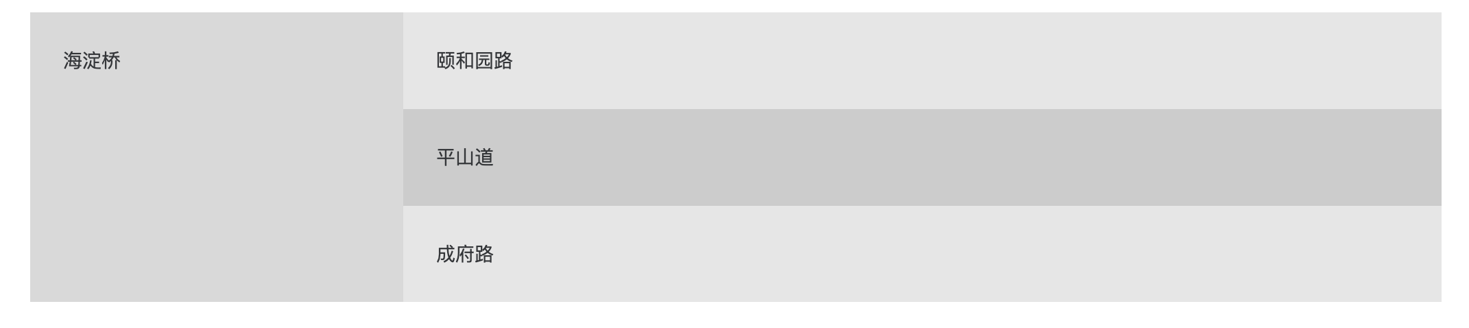
<n-layout has-sider>
<n-layout-sider content-style="padding: 24px;">
海淀桥
</n-layout-sider>
<n-layout>
<n-layout-header>颐和园路</n-layout-header>
<n-layout-content content-style="padding: 24px;">
平山道
</n-layout-content>
<n-layout-footer>成府路</n-layout-footer>
</n-layout>
</n-layout>
</template>
<style scoped>
.n-layout-header,
.n-layout-footer {
background: rgba(128, 128, 128, 0.2);
padding: 24px;
}
.n-layout-sider {
background: rgba(128, 128, 128, 0.3);
}
.n-layout-content {
background: rgba(128, 128, 128, 0.4);
}
</style>
我们在base-layout中增加一种样式(只写需要的代码):
<script lang="ts" setup>
import SideLayout from '../side-layout/index.vue'
</script>

<template>
  <SideLayout v-if="layout.layout === 'side'">
    <!--    -->
  </SideLayout>
</template>
修改全局主题配置项: 在config/layout-theme.ts中:
{
   layout: 'side', // 将mix调整为side
}
刷新页面
首先我们还是先占满全屏
我们将全部的配置项从mix-layout中拷贝过来
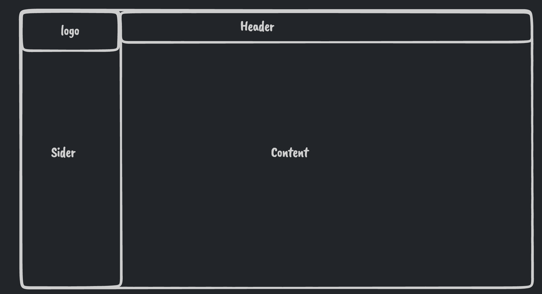
import { LayoutContent, LayoutSider, Logo, Title } from '~/layouts/common'

const props = withDefaults(defineProps<{
  headerHeight?: number
  logo?: string
  title?: string
  siderWidth?: number
  siderCollapsedWidth?: number
  showSiderTrigger?: boolean | 'bar' | 'arrow-circle'
}>(), {
  headerHeight: 48,
  siderWidth: 240,
  siderCollapsedWidth: 48,
})
const headerHeightVar = computed(() => `${props.headerHeight}px`)
const contentHeightVar = computed(() => `calc(100vh - ${props.headerHeight}px)`)将n-layout-sider �替换成
<LayoutSider
  :collapsed-width="siderCollapsedWidth"
  :width="siderWidth"
  :show-trigger="showSiderTrigger"
  content-style="padding: 24px;"
  >
  海淀桥
</LayoutSider>样式部分和mix-layout相同
.pro-admin-layout-header{
  height: v-bind(headerHeightVar);
}
代码部分:
<n-layout-header
  class="pro-admin-layout-header flex items-center justify-between px-4"
  >
  颐和园路
</n-layout-header>将n-layout-content�替换成LayoutContent�
<LayoutContent content-style="padding: 24px;">
    <slot />
</LayoutContent>
但是由于我们的布局高度没有撑开,导致了背景色没有完全铺开,那么我们先来调一下layout的背景色。
<n-layout style="--n-color: var(--pro-admin-layout-content-bg)">

</n-layout>
这样就可以正常生效了
接下来我们的侧边栏是支持两种颜色的模式的,支持反转色模式。 所以我们在属性中传入一个:inverted来支持,默认是false
const props = withDefaults(defineProps<{
  headerHeight?: number
  logo?: string
  title?: string
  siderWidth?: number
  siderCollapsedWidth?: number
  showSiderTrigger?: boolean | 'bar' | 'arrow-circle'
  inverted?: boolean // 反转色
}>(), {
  headerHeight: 48,
  siderWidth: 240,
  siderCollapsedWidth: 48,
  inverted: false, // 默认不起用
})
在template中
<LayoutSider
      :inverted="inverted"
      :collapsed-width="siderCollapsedWidth"
      :width="siderWidth"
      :show-trigger="showSiderTrigger"
      content-style="padding: 24px;"
    >

</LayoutSider>
然后我们在base-layout中传入配置:
<SideLayout
    v-if="layout.layout === 'side'"
    :logo="layout.logo"
    :title="layout.title"
    :show-sider-trigger="layout.showSiderTrigger"
    :sider-width="layout.siderWidth"
    :sider-collapsed-width="layout.siderCollapsedWidth"
  >
    <router-view />
  </SideLayout>
然后配置一下我们的logo和标题
<LayoutSider
      :inverted="inverted"
      :collapsed-width="siderCollapsedWidth"
      :width="siderWidth"
      :show-trigger="showSiderTrigger"
      content-style="padding: 24px;"
>
      <div class="flex items-center">
        <Logo :src="logo" />
        <Title :title="title" />
      </div>
</LayoutSider>